One of my final assignments was to redesign the Pepsi Canada website, along with a Facebook canvas, and a mobile version of the website.
Web:

Facebook contest canvas:

Mobile:

One of my final assignments was to redesign the Pepsi Canada website, along with a Facebook canvas, and a mobile version of the website.
Web:
Facebook contest canvas:
Mobile:
I just want to show off an awesome illustration. A group of classmates and I made a short film that may or may not include people in banana suits. I liked a particular still from the film and it was later drawn by the talented and lovely JoanneFX. I highly suggest checking out her work! It’s always been a bit of life goal to see a cartoon version of myself (maybe as a guest spot on Family Guy) and I’d say this damn well counts!

The original still:

Have to admit I’ve haven’t taken to coding with ActionScript as smoothly as I did with web coding, but it’s an interesting subject that opens a lot of doors. But here is a early prototype of a cool project I hope to explore.

It’s just a bit of fun. Something this simple could have been done just using buttons but I wanted some AS3 practice plus I found it ran just a tad smoother with the embedded code.
Once you check it out you might notice the circles look familiar, which something else I’d like to mention. To any another aspiring designers out there, I just wanted to say I think it’s a really good idea to design/make as any projects as possible just for fun. Even if you’re busy making stuff for school/clients, you never know what you might end up drawing inspiration from. And the bigger arsenal of work you have, the bigger the pool of assets you then have access too. I have a few other examples of this so I might write a separate blog post detailing this further at a later time.
Anyway, enjoy the circles!
So I recently underwent the interesting process of creating a run cycle animation in Adobe Flash. It was to be a completely hand-drawn, frame-by-frame animation which had to show each all the different poses someones makes when they’re running. The first step was to find inspiration and a reference to base my drawings off. After some searching around, I liked this one the best.
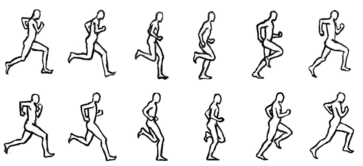
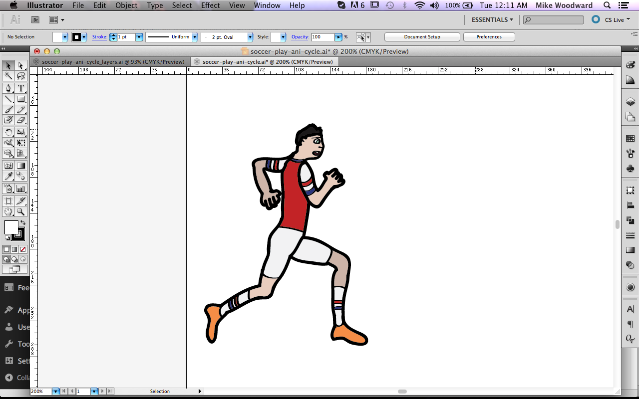
This was one of the more realistic looking human bodies I found. I had decided to base my run-cylce on a soccer player and I wanted to give a realistic look oppose to a cartoon style. Now it was time to open up Illustrator and to get work, I had twelve frames of somebody running to draw.
I used two of my new best friends (a Wacom tablet and Illustrator’s brush tool) to create the outline of my soccer player.

Then I added colour, using the pen tool to draw shapes underneath.
This would be the point where usually I’d have said I was finished drawing. But for this assignment I now had to do this eleven more times. And I have to keep all the existing proportions I’ve established in this first drawing. But luckily I’m dealing with vector artwork, and Illustrator is home to many features that’ll help me do this.
Firstly I’d copy-and-paste this drawing and then begin all the edits. Objects like his arms I could just select the right paths and shapes, and move and rotate them. Of course once the back arm starts disappearing behind the torso, a little more editing is required.
The legs are where the majority of the work was done. I’d select one of the legs and move it roughly to where it needed to be to give an idea what of it’s supposed to look like. But then I’d bust out the direct selection tool and the whole pen tool family (add, minus, convert anchor point) and really get to work. As I’ve found in the past with Illustrator projects it can be tough to get your grove at first but eventually you get the hang of it and the process moves much faster.
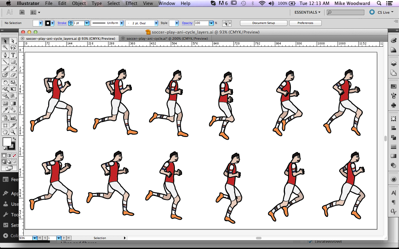
The run-cycle illustration was completed. Now it was time for the actual animating to begin.
The first step was to import each pose into Flash as it’s own keyframe. You can do this directly from Illustrator exporting it as a swf file and choosing keyframes. But I ran into a few issues after exporting this way as the soccer player’s hands and hair would look all messed up. I later found discovered this was because you’re converting from Illustrator vector to Flash vector and some of the stroke properties aren’t the same, so a solution would have been to convert the strokes to shapes before exporting. However instead I just imported the ai file directly from Flash (hooray for Adobe cross-platform user ability).
So I imported these drawings to the stage inside a movie-clip each on their own keyframe. I then went through and changed each frame’s positioning to x=0, y=0 so the player was running in stationery position. For those unaware, when dealing 2D animations of this nature the background moves, not the runner.

The next step was creating the background. I wanted to have a sports field for him to run on and this was a bit of a tricky component because all the lines on field had to be evenly spaced apart, and seeing as the background has to loop, the first and last lines had to be perfect or else the animation would glitch.

To create a parallax background I needed to have two elements of the background moving at different speeds to create some depth of field. The grass field would be in the foreground, and in the background I wanted have the crowd moving at a slower speed.
If you look at the layers, “newcrowd” takes the entire duration of the animation to scroll across the stage. Whereas it takes two instances of the grass field (layers “grass” and “grass2”) to cover the same distance.

Lastly to give this animation an extra kick (no pun intended) I added a soccer ball and there were a few animations to go along with it.
This was another instance of an embedded movie-clip as I put the animation of the ball rotating inside the movie-clip. I also found it easier to place the ball’s shadow inside the same movie-clip just on a different layer, because unlike the runner’s shadow, I was also animating the ball on the main timeline and I didn’t want to have to do everything twice. I wanted to have the ball move around and be kicked by the soccer player. This also required perfect timing and I had to count out the exact frames where I knew the player’s foot would be extended forward as to create the appearance of him kicking the ball.
You can check out the final animation here!
Overall I really enjoyed this project. I remember last year when I was first learning Adobe Illustrator I soon realized how much I liked the vector format. Now learning Flash I can take my love for Illustrator to a whole new level. Expect to see more cool Flash work from me in the future!
I’m uploading something a little different today. Instead of a bunch of images of designs I’ve been working on, let’s actually just talk about design. For an assignment I had to review an award-winning website featured on awwwards.com. This was a good exercise to get a feel for what does and doesn’t work in web design.
Overview:
The website I chose to do for my design analysis is urbotip.com, which is a website that allows users to report local issues in their city in the hopes that the cause will gain international exposure. It is mostly used in South America and issues can include traffic lights that stop working, streets that have don’t proper sewage disposal, no proper garbage disposal in certain areas, and things of that nature. It is easy to indentify that the motivation behind this website is moral. However there are also social aspects as users must sign-in through Facebook or Google accounts in order to comment on or “support” the causes.
The communication style of Urbotip.com is to inform, as it is creating awareness on issues you may be never been informed of otherwise. Just from my own standpoint I’m now aware of some of the issues affecting the day-to-day lives of certain people who live in Brazil for instance.
Design:
What’s interesting about the composition of the homepage is how it follows the trend of using the full screen. The homepage is divided into three sections. The first section is an overview of how urbotip works.

As you can see the content takes up almost the entire width of the screen and all of the content for that section fits above the fold. You’ll also notice in the centre bottom on the page a button that says, “scroll down and see what is happening on urbotip” which automatically moves you the second section of the homepage.

This section highlights the causes in the city you’ve selected and the people contributing. As you can see, it also takes up the entire screen.

Lastly you scroll down the third section and the same principle applies, as evident with the illustrations at the top.
Even though the homepage and it’s various section try to take up as much of the screen as possible, the website still has an easy-to-use navigation. The menu for all of the main webpages can be found in the top left corner (the first place the human eye is drawn to) and then further along the top in the right corner are the slightly lesser important information/pages like selecting the user’s country or the sign up/login page. But it is all easily findable. Once you navigate away from the homepage onto another page like “explore” or “urbotippers” the navigation menu turns into a drop-down menu that still remains the top-left corner. The buttons in the top-right corner remain the same.

The most interactive portion of the website is the “explore” page which features an interactive map that shows the locations of all the posted causes. This is a better way than just showing a list of the all causes because this way you can see exactly where in the world these issues are taking place. The different icons represent what category the issue falls under (eg; traffic) and once you click on one of the icons it brings up the cause for that location and after you click further it shows all the details, who’s been commenting supporting it, and shows the options to share the cause on other social media like Facebook and Twitter.

There is an effective use of colour and contrast on the website. The most part the site uses a lot of off-whites and greys that range from to really light to almost black. But where the real visual strengths come into play is with the bright pink colour ubrotip has clearly adopted as part of their branding. The website can already use the range of light-to-dark greys to create contrast but when it really needs to highlight an element it uses the pink colour. This is seen on the important buttons like “create a cause” or when you rollover a link.
The website doesn’t make much use of textures but I believe this contributes to one of the site’s largest strengths which is it’s overall clean look. The site looks simple but not too plain, it’s easy to look at, and it relies on just a few key illustrations/graphics to provide it’s visual spark.

I believe the semi-minimalist appearance is big factor in why this website got the acclaim it did from awwwards.com, combine that with the effective contrast and colour from the whites, greys, and bright pink, it makes for a very attractive design. But the interactive map was also likely a big component in it winning an award, as it’s a more visually appealing and engaging way to showcase local issues. The only area I feel the website could improve on would be having some sort of verification or moderation of the posted causes on the interactive map as noticed a lot of them were invalid and just full of nonsense. There should be a way to stop those from being posted and if not that then a least someone who goes through and looks at them afterwards and deletes any invalid causes.
But overall it’s a cool website, in fact I ‘urbotip’ my hat to the designers!
Using a combination of masks and blending modes I was able to textures to this flat 2D image. It was a fun little experiment that showed me yet more amazing features of the wondrous realm that is Adobe Photoshop.

Here’s a mockup I did in-class for a Leonard Cohen album gallery website.

Recently I’ve been honing my photo restoration skills. It can be a little tedious to stare at a mass of grey for so long but overall it was a strange kind of fun.

Filling in the cracks was easy, however it was much more challenging to fill the areas when the subject matter is completely nonexistent ( like the chin). I found the healing brush would come up too light so I either had to paint it repeatedly or use the clone stamp just to put something there and then could use the healing brush to adjust the textures. If I wanted I could spend considerably more time on this because it’s far from perfect, but I suppose it’s a decent job as it stands.
I’ve been learning some great tips for digital painting. Manipulating channels and selections in Photoshop to isolate the line-work is super cool. So here’s a digital painting I did of some characters from Cloudy With A Chance Of Meatballs . In my experience I really enjoyed colouring the line-work and all the flat colours, however I got quite frustrated when it came to the shading, I’ve never been much of a painter IRL and I guess that showed here. But still a fun little project and I’ll definitely be practicing my painting skills.

I also created some custom brushes for this project. They’re pretty nifty so you can download them here if you’d like.
And of course workflow is key, so check out how I organized my layers.

The initial grouping of layers.

The various sections inside Steve.

All the different parts to Flint.
Can’t help but show off the awesome technology I used today. Ignore the 2nd grader’s sketch on the screen (that was the style I was going for…yeah let’s say that) and marvel at the beauty that is a Wacom Cintiq!
